It is finally proven – colour is entering our Swedish homes. Colour experts, designers and architects. Northern Europeans have jumped on the colour bandwagon and paint everything – from floor to ceiling.
Say "Scandinavian style" and most people will picture light interiors. In a recent forum discussion, Houzz asked its users in Sweden to describe the style in one word, and most listed white, light, simple and close to nature.
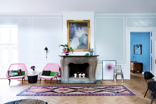
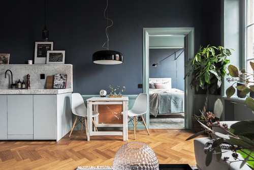
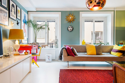
But this is changing. In recent years, colour and darkness have sneaked into campaign shoots, inspirational images and the walls in Scandinavian homes. The Swedes have longed for grey living rooms, blue-green bedroom walls and gratefully received colour codes when they spread from influential trendsetters through blogs and comment sections.
Why do northerners suddenly welcome colour and how is it used? With the help of trend studies and looking to the future and history, we have traced colour's journey into the Nordic home and are able to show that Scandinavian homes are in fact anything but minimalist.
Why do we think about our Nordic homes as light? Stockholm is Scandinavia's sunniest capital city, with about 1800 hours of sunshine per year, but that is still at least 1000 hours of sunshine less than for example in Madrid, Sydney, and Miami.
"The foundation of the Scandinavian design, and our Nordic homes, will always be light and easy, as we simply need that in the lack of sunlight," says Karl Johan Bertilsson, who is the Creative Director of NCS Colour Academy, consulting colour manufacturers, architects and designers worldwide.
"What we see now is a change. In the last two, three years, the colourful colours have made a come back," says Bertilsson.
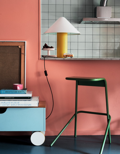
"At trend shows and fairs we have seen interiors, which have gone from more neutral colours to blue and violet, on to more bright colours and most recently orange, pink, yellow, and red."
"Trends are often a reaction to the past. The fashion industry is the fastest, but interior design is not far behind. Since the turn of the millennium, and until now, neutral colours like white and grey were dominant in many homes. The colours that are spreading now are simply a response to that. But it is important to remember that trends are partly a speculative phenomenon but also a process, which sometimes overlaps and can only gain a foothold when we are mentally susceptible to it. If vivid colours had become fashionable five to ten years ago, they probably would not have been welcomed the same way."
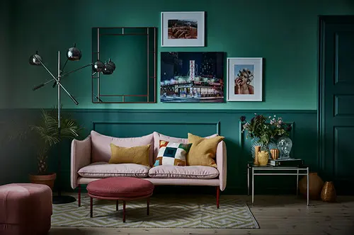
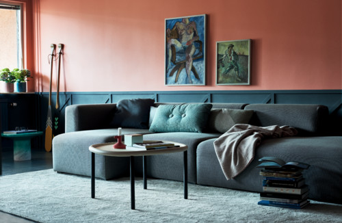
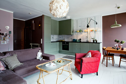
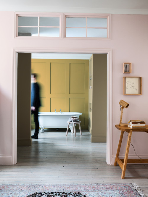
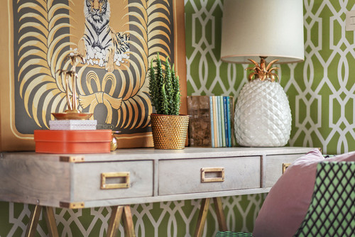
One who dared to paint and whose home has received much attention is Daniel Heckscher, architect and designer at Note Design Studio in Stockholm. In his apartment, the only white interior detail is the herringbone hallway flooring. The rest of the home is painted in a colour palette that spans across turquoise, salmon-orange, pink, blue-green and bright yellow.
In the new bookazine My Residence, he says he believes that people dress in black and decorate in white because they dare not do otherwise: "They are afraid to make decisions and afraid to make mistakes. We Westerners are too controlled by our fears. Life is not colourless! Even in early spring, when Sweden's at its palest, there are 7000 different shades outside the window. I do not understand how you as a designer and creator want to represent an imaginary existence?"
What determines when the colour trends break through? Bertilsson refers to studies based on the NCS trend analysis: "There is research that shows that colour trends are cyclical. Austrian Dr. Leonhard Oberascher studied colour psychology and has been able to prove that colour trends are somewhat repetitive in themselves every 10-15 years. When everything is very white and neutral, you get tired after a while and want to go to the other extreme. That is how we humans work with everything, colour is no exception. What he more specifically has succeeded to identify is the steps we go through along the way. It was very neutral in our homes a few years ago, then the colours blue and violet entered the picture. Then, the more vivid colours come and finally they subdue and go into tones of brown and beige before they return to neutral. The reality is exactly the pattern Oberascher succeeded in mapping."
There are other factors that also come into play. Theoretical trend pyramids show that how susceptible we are to trends depends on where we work, where we live and how we live.
"Everyone will be affected by trends, whether we like it or not. The Swedes and the Danes have the privilege of, thanks to our geographic, social and cultural conditions, being able to repaint our homes, not just because we want, but because we can. So then when the vivid colour trends emerged, we are quick to embrace them," says Bertilsson.
He continues: "In many other countries, they decide to repaint when the colour of the wall begins to flake. In Sweden and Denmark the painting shops are similar to interior design shops because when we invest in paint, we look at the whole. We want to fulfil a new idea, which colour plays a big role in."
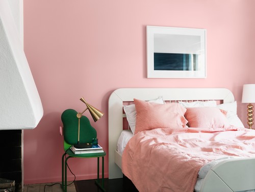
The Nordic awareness of colour and furnishings has recently further strengthened thanks to the influential interior design bloggers who generously shared colour codes and colour tips. Perhaps the most popular bedroom colour in Sweden in recent years has been "Tant Johannas Gröna", after the stylist and blogger Johanna Bradford painted her bedroom in a grey-green colour.
"The fact that there was so many questions about that colour was probably partly due to the timing, white walls had dominated for many years, and people were probably hungry for something different. But also because it is difficult to find the right colour and that colour is so incredibly nice. If you see a colour you like, you might as well ask for the colour code."
So even though people in the Nordic region are beginning to paint with colour, we still seem to be doing it within certain frames: "We dare more than just white but I think that the result is still quite similar because many people choose the same colours," says Johanna Bradford.
But do not be fooled by the last decades of white and believe that the colourful walls in the Nordic home is a new phenomenon.
Karin Fridell Anter is an architect and together with Henrik Wannfors wrote the book 'Så målade man: svenskt byggnadsmåleri från senmedeltid till nutid' ('How we painted: Swedish building painting from the late Middle Ages to the Present'). Coloured walls have come and gone in Swedish homes repeatedly throughout history. What really has controlled colour choices has been pigment and current style trends.
"The trend pendulum is constantly swinging, as a reaction to what has been – the difference is that it is accelerating. In the 1970s, we painted and wallpapered with vivid colours and large patterns, reminiscent of the Baroque period. 1980 was a backlash to that with lighter pastels and in the 1990s, ones again colours were back, mottled with earth tones such as terra cotta, or blue and/or bright yellow," she says.
"Going back, the changes did not come in as quick a succession, and the differences were mostly between wealthy homes in the city and peasant households in rural areas. What was desired among the peasantry was in many ways an imitation of that which had existed in the trendsetting upper class homes for many years. When middle-class homes began to use expensive wallpaper in the late 1900s, some of the peasant households that could not afford the wallpaper, hired painters who painted stencils on the walls. It is interesting to think about the cost balance today."
Were the homes painted for more practical reasons before? "No, the purpose of the interior painting in Sweden has always been to make the home beautiful and to manifest something: that you by the motifs on the walls, colour choices, or the decorations was a godly man, rich or aware of the trends that dominated in other cultures on the continent. In the same way that today’s Swede expresses himself or herself through their interior – just as the home was a status marker in previous centuries as well," explains Anter.
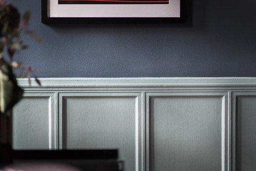
Coloured walls in itself is not a new phenomenon in Scandinavia. But is the way that we paint different from the past? "Until the Stockholm Exhibition in 1930, when functionalism was introduced, it was the decorative painting that had been popular, and painted surfaces were never painted in one single colour, instead they had pictures, patterns or imitations of marble or hardwood. Functionalism represented a new trend in the sense that it was the beginning of painting entire walls in the same colour, perhaps with a different colour on the next wall. What we see now, with monochrome rooms and painted ceilings and moldings, is like an extension of that," says Anter.
Psychological phenomena, colour as a personal expression and prevailing trends, seem to be part of the explanation for the northerners sudden love of colour. But another strong factor that also controls the phenomenon is what goes on in the world.
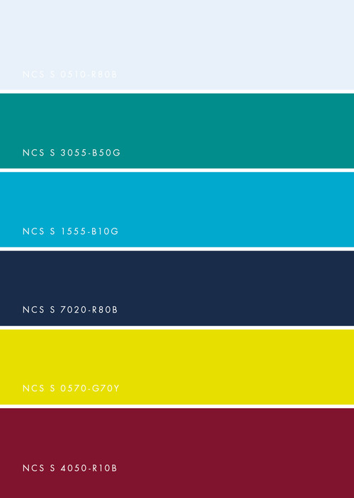
The NCS trend analysis for 2016 takes into account the political events, the impact of digitization and global phenomenon when predicting the future. "We believe that controversy is governing the coming years. The unrest in the world, increased urbanization and stress lead on one hand to a roughness that continues the industrial style, with cold and hard colours. At the same time, the same factors lead to increased escapism, to places we dream about going and get inspired by exotic locations, the world’s ocean’s unknown depths and colours of the tropics. The trend will be triggered by upcoming world events such as the Olympics in Brazil," says Bertilsson.
The big difference between the company's analysis from last year and 2016 is that the colours have now gone darker and further out on the edges, closer to its extremes than before. From the light, soft shades to more dramatic, darker colours.
A word that often comes up when talking about Scandinavian style is nature. Has that created the basis of the colour trend?
"There are absolutely connections. Last year we found that escapism mainly had to do with dreams about the countryside. When urbanization forces us to live narrower, smaller and among more noise, we create other mental worlds, we dream of lush trees and open fields," says Bertilsson.
The Swedish wallpaper company Sandberg recently released a collection on the same theme. They write in their trend report that an insecure world led to a greater interest in our homes: "Interior design has become both more important and more complicated. With a serious environmental conscience, we try to find ways to consume as little and consciously as possible, while we want to be updated on news and trends."
The paint company Alcro also encourages bringing nature into our Scandinavian homes and describes some of the colours for 2016: "brings to mind the entities of the forest, misty meadows and enchanting dreams in the hours of the dawn."
With that in mind, the blue-green tones, which have spread on the walls of Sweden and Denmark, do not feel so unexpected. If you believe Dr Oberascher, we would find ourselves somewhere in the middle of the trend cycle now, and can look forward to warmer walls before being subdued by and eventually become white again. In hindsight, the Scandinavians seem to be quick to adapt to new interior design trends and the question does not seem to be if we will all jump on the colour trend but rather, when.
Unlike the 18th and 19th century, when the colour trends could take several decades to reach the Swedish farms, the wheel spins faster now, and takes place parallel, in 2016’s digital and global world. Maybe there has never been a reason to dispel the myth of white, Scandinavian homes. Because who knows – that freshly painted, colourful wall might not even get dry before the trendsetters have painted it white again?